Payal Spice Mart New Zealand Logo Design
The logo for “Payal’s Spice Mart” features a dynamic and colorful design that perfectly encapsulates the essence of a vibrant spice market. At the heart of the logo are three stylized chili peppers in green, red, and yellow, artfully arranged to resemble a flame, symbolizing the heat and zest associated with spices.
Below the peppers, the text “Payal’s” is elegantly written in a red, decorative font, while “Spice Mart” is displayed in a complementary green font with a similar decorative style. The combination of colors and fonts creates a harmonious and eye-catching effect, making the logo both appealing and memorable.
This logo, designed by Dsigngo Group, effectively communicates the brand’s focus on offering a wide variety of high-quality spices. The clean and vibrant design ensures that it stands out, attracting customers with its visual appeal and clear representation of the spice theme.
- CLIENT Payal Spice mart NZ
- YEAR 2015
- WE DID Create Logo Design and Brand Guideline
- PARTNERS Danuka Rathnayaka
- CATEGORY Branding , Graphic Designs , Logo Design
- TAGS Brand Guidelines , Graphic design , Logo Design
Related Projects

ZuZI Clothing Store New Year Leaflet
ZuZI Clothing Store New Year Leaflet Design Printed on 120…

Car Portal Company Profile
Company profile design for Car Portal PVT Ltd. 2023 This…

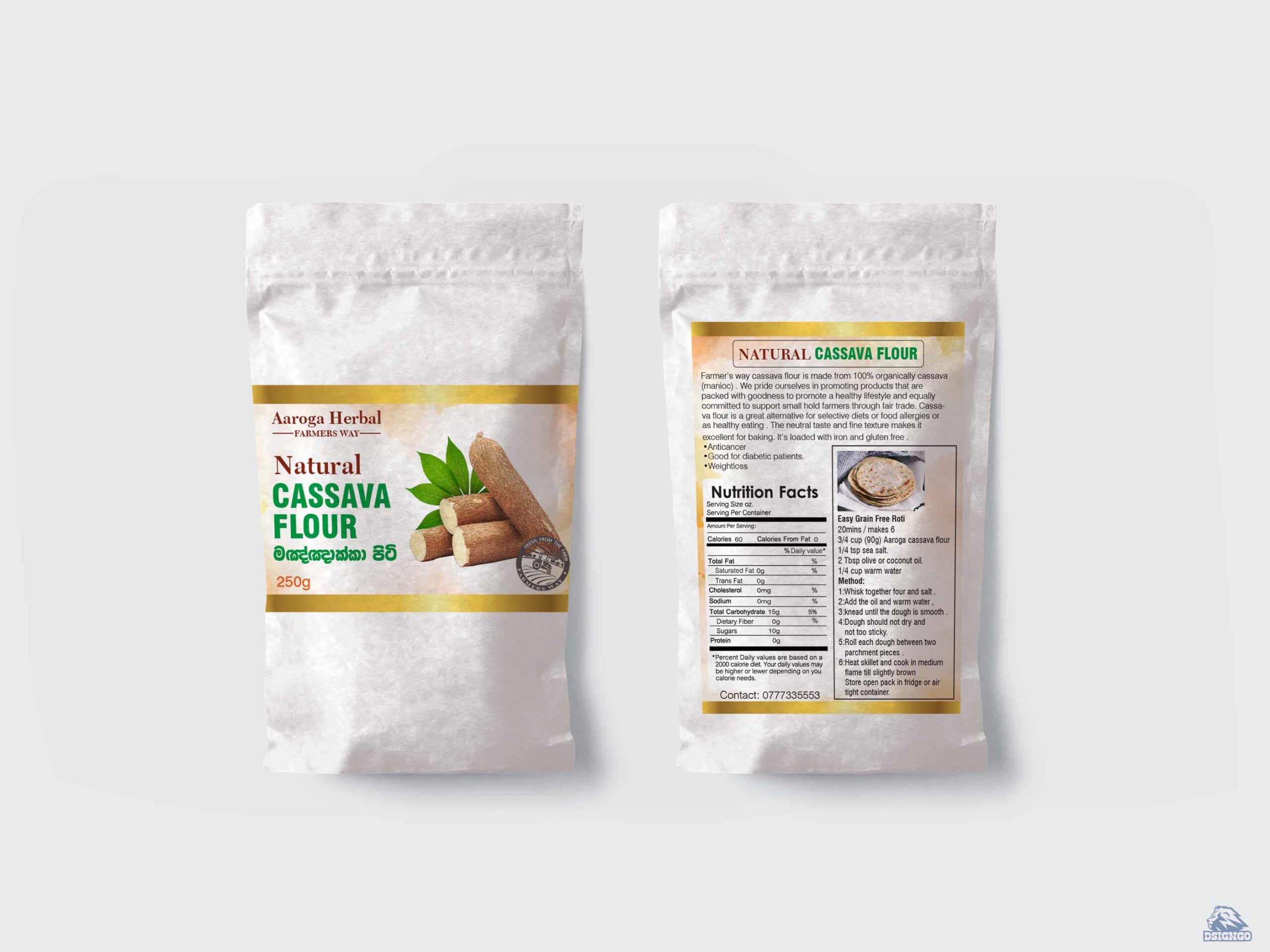
Cassava Flour Packaging Design
Farmer’s way cassava flour is made from 100% organically cassava…